
Visual Identity
Black, White, Purple and Gold in Premium Branding
Wiseland Studio · October 28, 2026
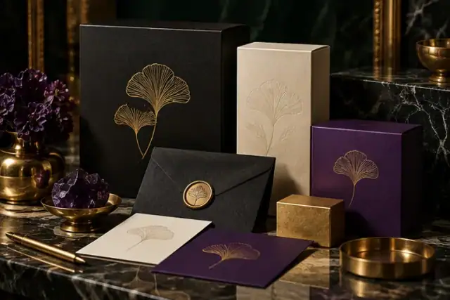
A premium identity often uses black, white, purple or gold, but none of these colors guarantees a premium result. The effect comes from proportion, spacing, type and the quality of the final material. Gold used everywhere stops acting as an accent. Purple with weak contrast can make elegant copy hard to read. Start with a restrained system that can survive ordinary production.
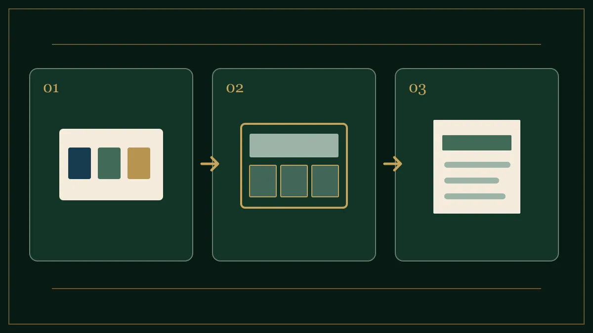
Build a neutral foundation
Choose a near-black and a warm or cool white that work together. Use them for the majority of page or printed surface area, then introduce one characteristic hue. If purple is the signature, decide whether it belongs in large fields, borders or small details. Test several lightness levels; a dark purple may need light text while a pale purple needs dark text.
Treat gold as a material decision
Metallic foil, flat gold ink and an RGB gold gradient are not interchangeable. A business card printed with ordinary process inks cannot reproduce the reflection of foil. Ask the printer for a proof and compare it under real light. On a website, use a flat accessible color for text and reserve decorative gradients for nonessential details. Never put key information in low-contrast gold simply to suggest luxury.
Check the complete system
Make a one-page contact sheet: website header, mobile menu, business card and invoice. Reduce it to thumbnail size. If every element demands attention, remove ornament. Look for one clear heading, enough breathing room and a consistent accent. The brand should still be recognizable in a one-color version, since printing, stamping and social avatars may require it.
Before approving the palette, compare its typography and contrast with the brand color palette guide, then review our visual identity projects for examples of consistent application. If a proposed luxury treatment works only in a large mockup, it is not yet a reliable identity system. W3C text contrast criteria offer a useful minimum for its digital copy.