
Visual Identity
Blue and Green Brand Colors Without the Clichés
Wiseland Studio · October 26, 2026
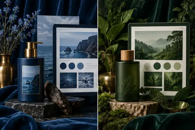
Blue and green are common starting points for brands that want to appear steady, fresh or connected to nature. Those are possible readings, not properties built into the pigments. A bright cyan, a dusty blue and a near-black navy signal different levels of formality. Mint and forest green behave just as differently. See the whole system before assigning a meaning to one swatch.
Compare the market before choosing a shade
Put the marks and websites of five direct competitors on one page. Note hue, lightness and saturation rather than saying only “they use blue.” If every competitor uses saturated royal blue, a quieter blue-green or a different supporting color may help recognition. Distinctiveness matters when the customer sees many options together.
Test tone and pairing
Create three versions of the same sample: deep blue with warm paper, pale blue with charcoal, and a blue-green with a restrained accent. Try the chosen shades in body text, links, navigation and a small mark. Light green on cream may look elegant in a palette chart but disappear at normal reading size. Darker text or a stronger neutral can solve the problem without abandoning green.
Check real materials
Screens emit light; printed stock reflects it. Photograph a printed proof beside the on-screen design, then compare in normal daylight. Review the mobile version outdoors as well. Color-only labels for success, error or status can exclude users who cannot distinguish the hues; add words or icons. These checks matter more than a claim that blue automatically “builds trust.”
Write a one-page rule for each chosen color: where it is used, what it sits on and what it must never carry alone. For a structured starting point, see our brand color palette and accessibility guide. The W3C guidance on color use explains why meaning should not rely on color alone. Our context guide helps frame the audience test.