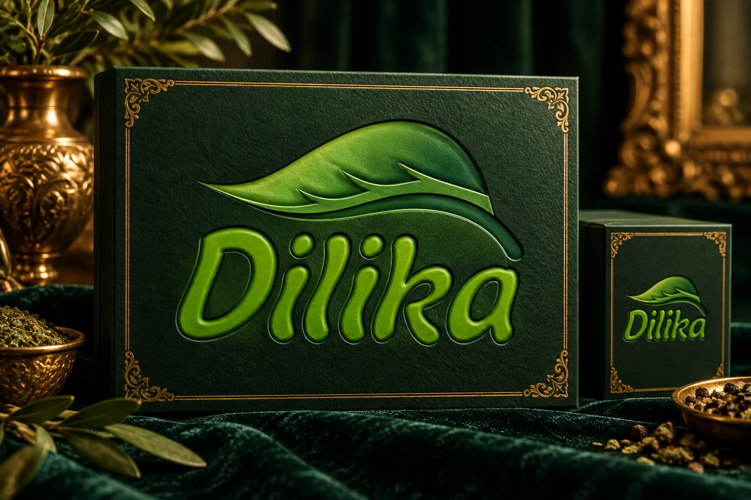
Logo Design for Dilika Food Company
Project overview
We designed a logo for Dilika, a food company, pairing the brand name with a flowing and memorable form. The relationship between the wordmark and symbol is the foundation of this visual identity.
Visual direction
The symbol's soft, leaf-like movement suggests freshness and a connection with nature, an interpretation that suits the company's place in the food sector. Layers of green add depth while keeping the identity centered on a color associated with freshness.
Design and execution
The Dilika name uses rounded, expressive lettering. The smaller word “The” and the flowing symbol above complete the lockup. The movement of the symbol balances the legible wordmark, giving the identity character while keeping the brand name clear.
Deliverables
- Logo design for Dilika, a food company
- A The Dilika wordmark paired with a flowing green symbol
- A dimensional presentation using layered green tones
Outcome
The identity brings the Dilika name together with a fluid form and a green palette. This combination gives the logo a fresh, recognizable character and a cohesive base for the brand's visual presence.
Mockup presentation
Dilika logo mockup