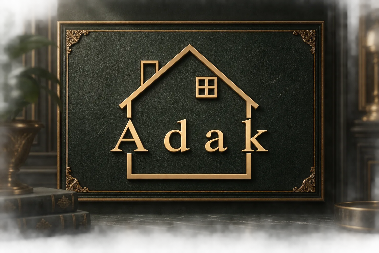
Logo Design for Adak Real Estate
Project overview
We designed a logo for Adak, a company in the real estate field. The central idea was to pair the brand name with a clear symbol of home, creating a mark that is simple to recognize and immediately connected to property.
Visual direction
A roofline, window and open frame form the core of the identity. The house shape sits with the Latin Adak wordmark, while the lower frame brings the composition together. A gold finish against a dark ground gives the presentation strong contrast and a formal, distinctive character.
Design and execution
The brand name remains the focal point, framed by architectural lines that also signal the real estate context. Keeping the elements simple helps the logo remain recognizable at different sizes. In the presented version, the contrast between gold and the dark background brings the mark's details forward.
Deliverables
- Logo design for Adak, a real estate company
- A Latin Adak wordmark paired with a house and window symbol
- A gold-on-dark logo presentation
Outcome
The Adak logo places the brand name within a simple architectural form. The roof and window connect the mark to homes and property, while the gold finish gives the design a clear visual signature.
Mockup presentation
Adak logo mockup