
Graphic Design
Typography in Brand Identity: A Practical System
Wiseland Studio · September 23, 2026
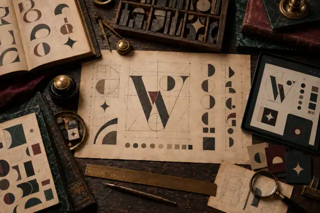
Typography in Brand Identity: Build a System, Not a Font List
Typography is one of the most frequently seen parts of a brand. It shapes a website headline, a packaging label, a proposal, a social post, a sign, and a support message long after the logo has left the frame. A useful identity therefore treats type as a connected system of roles, rules, and tested behaviours.
Begin with communication contexts
List where people will read the brand during its first year: mobile interfaces, long articles, packaging, presentations, environmental graphics, invoices, or campaigns. Record the required languages, numerals, symbols, weights, and production methods. A typeface that looks distinctive in one large headline may fail in dense tables or small labels.
Give every type style a clear role
Define a small set of repeatable roles before choosing many variants: display, primary heading, secondary heading, body, caption, label, and data. Specify size, weight, line height, spacing, and maximum line length for each role. Hierarchy should remain visible even when colour disappears or the page is viewed in grayscale.
Pair typefaces by behaviour
Two families do not need identical shapes, but they should cooperate. Compare visual density, stroke contrast, character width, rhythm, punctuation, available weights, and the space each script occupies. Test real navigation, prices, dates, names, and mixed-language sentences instead of judging an isolated specimen.
Build a responsive scale
Typography should adapt to the reading distance and available space. Use a restrained scale with fluid sizes where useful, then set deliberate limits for large and small screens. Check long headings, narrow cards, buttons, forms, and error messages. Good responsive type preserves priority without forcing every device into the same proportions.
Test accessibility and language coverage
Verify contrast, readable body size, comfortable line height, visible links, and clear focus states. Confirm that every required character, numeral, punctuation mark, and emphasis style exists in the licensed files. Test fallback fonts too: a delayed or failed webfont should not hide content or destroy the layout.
Check the system in real applications
Apply the proposed rules to several demanding touchpoints before approval. A landing page reveals hierarchy and responsive behaviour; packaging exposes small sizes and production limits; a presentation tests repeated structure; signage tests distance. Problems found in realistic layouts are more valuable than preferences formed from a type specimen alone.
Document decisions for consistent production
A practical typography guide includes font files and licences, approved families and fallbacks, role definitions, responsive sizes, line lengths, alignment, numeral rules, multilingual examples, accessibility notes, and prohibited treatments. Include editable templates so collaborators can follow the system without rebuilding it from memory.
Typography becomes part of brand identity when the same voice survives different languages, formats, teams, and technologies. For the wider visual system, read about complete brand identity design or discuss your project.