Stationery & Exhibition Posters for Behtash Negin Pooladsa
Project overview
This commission for Behtash Negin Pooladsa brought together practical print pieces for formal correspondence and exhibition communication. The set includes a two-sided corporate letterhead and two exhibition posters, prepared in Persian and English. Each piece needed to work on its own while still feeling part of the same visual family.
The brief
A company letterhead is used for everyday formal communication, so it needs generous writing space and contact details that are easy to find. An exhibition poster has a different job: it must introduce the company and its field of work quickly, then give visitors a clear next step. The challenge was to bring these distinct needs together without losing the client's existing visual identity.
Visual direction
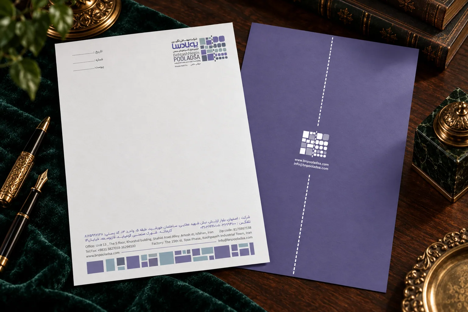
The reverse letterhead's violet sits alongside pale neutrals and the company's geometric mark. The exhibition posters use cobalt blue and complementary colors; this distinction gives each item its own character, while the modular mark connects the set. Open space and a clear type hierarchy keep the industrial information easy to scan in print.
Design and execution
On the front of the letterhead, the company mark and name anchor the upper area, leaving the main sheet open for correspondence. Address and contact details sit in a compact footer. The reverse uses the violet field with the geometric mark, website and email for a stronger brand statement.
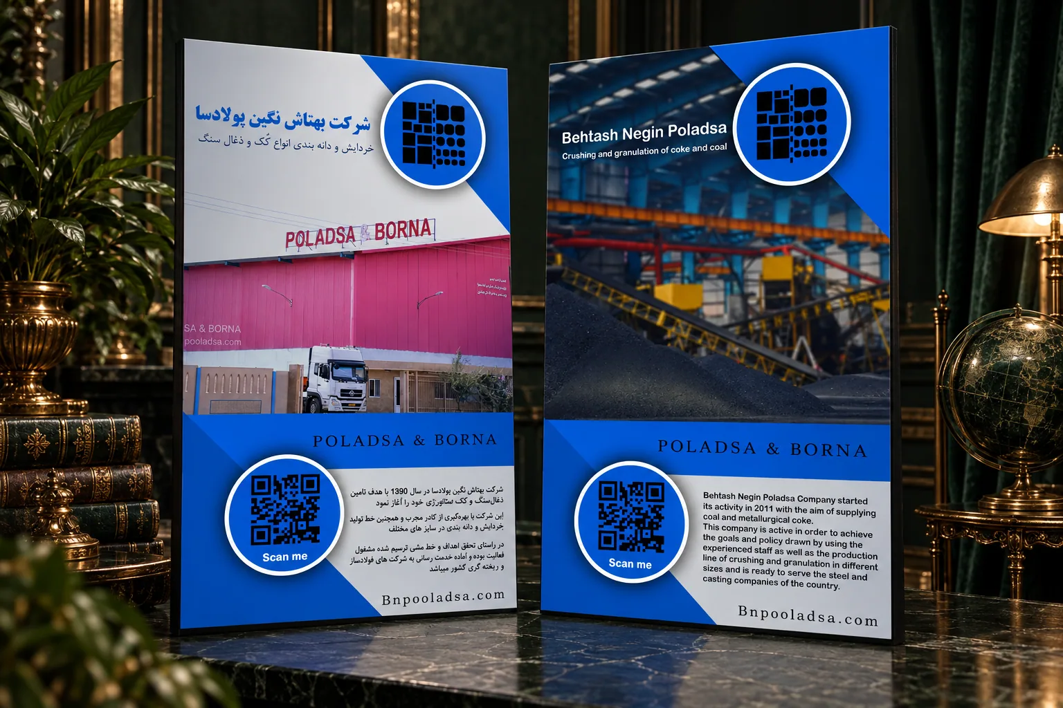
The exhibition posters extend the visual language into a vertical format. Persian and English versions combine an industrial facility image, a concise company introduction and a QR code, giving visitors a way to continue the conversation after seeing the display. Cobalt blue and the shared geometric mark carry through both languages.
Deliverables
- Front and reverse design for a corporate letterhead
- Persian exhibition poster
- English exhibition poster
- A coordinated print language adapted across formats
Outcome
The result is a print set that connects Behtash Negin Pooladsa's day-to-day correspondence with its exhibition presence through geometric structure and clear information. The violet distinguishes the letterhead reverse, while cobalt blue identifies the exhibition posters.
Mockup presentation
Front and reverse letterhead mockup
Persian and English exhibition poster mockup